The role of color in graphic design and how to use it effectively.

Color is an essential element in graphic design. It has the power to evoke emotions, create moods, and communicate messages. Choosing the right colors for a design can make all the difference in its success. In this article, we will explore the role of color in graphic design and how to use it effectively.
Color Theory
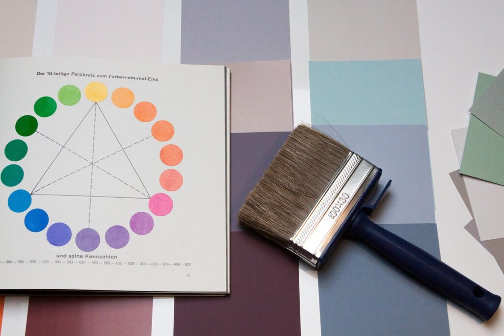
Before delving into the use of color in graphic design, it is essential to understand color theory. Color theory is the study of how colors interact and how they can be combined to create effective designs. It is based on three primary colors: red, blue, and yellow, and the secondary colors that result from combining them: green, purple, and orange.
Color theory also includes concepts such as color harmony, contrast, and saturation. Color harmony is the use of colors that work well together, while contrast is the use of colors that are opposite on the color wheel to create interest and impact. Saturation refers to the intensity of a color and its ability to evoke emotion.

Choosing Colors
Choosing colors for a design involves understanding the client’s brand and the message they want to convey. It is important to consider the psychology of color and how different colors can evoke different emotions. For example, red is associated with passion and excitement, while blue is calming and trustworthy.
Once the designer has a clear understanding of the client’s brand and message, they can begin to choose colors that will effectively communicate that message. It is important to consider color harmony and contrast to create a visually appealing design. Additionally, the designer should consider the use of white space and the overall balance of the design.

Using Colors Effectively
Using colors effectively in a design involves understanding the hierarchy of information. The most important information should be highlighted with the most prominent color, while less important information should be presented with a less prominent color. The designer should also consider the use of color to create emphasis and focus on key elements of the design.
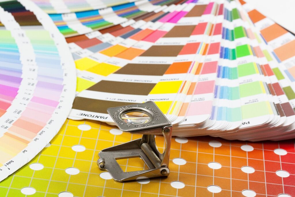
It is also essential to consider the use of color in different contexts. The same colors may look different on a computer screen than they do in print, so it is important to test the colors in different formats to ensure consistency.

Color is a powerful tool in graphic design. Understanding color theory and the psychology of color can help designers choose colors that effectively communicate the client’s brand and message. Using colors effectively involves considering color harmony, contrast, and saturation, as well as the hierarchy of information and the use of color in different contexts. With the right approach, color can elevate a design and create a strong, memorable brand.